joanneum weasels racing team

The FH Joanneum University of Applied Sciences is home to some 40 courses of study in areas of International Business, Information, Design & Technologies, Environmental Studies and Health Sciences. The following project was made possible through the cooperation of students with a background in (almost) all of the aforementioned fields of study and I’m proud of the fact that I was also a part of it once.

Formula SAE® is a student design competition organized by SAE International (formerly Society of Automotive Engineers) dating back to 1979. To quote their website:

The concept behind Formula SAE is that a fictional manufacturing company has contracted a design team to develop a small Formula-style race car. The prototype race car is to be evaluated for its potential as a production item. The target marketing group for the race car is the non-professional weekend autocross racer. Each student team designs, builds and tests a prototype based on a series of rules whose purpose is both to ensure onsite event operations and promote clever problem solving.

Our University took part in this competition in 2003 in the UK and won the Marketing portion of the competition with no actual car constructed. University of Toronto won the Overall Event in this year, by the way 🙂

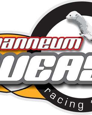
In 2004 I joined the team and was in charge of marketing, advertising and designing a website for the “joanneum racing” team, as it was called at the time. As soon as I heard that extra points were added for the marketing presentation and that there were close to 200 teams, I knew that the team name and appearance had to be unique, distinguishable and easy to remember. After spending some time browsing basketball, American football, hockey and other team sport websites, I came to the conclusion that we also needed a mascot, an animal that would depict the characteristics of the team spirit and the car itself.

The car was an aggressive, all-wheel drive monocoque bullet that wrinkles the race track behind it; fast, deft and highly maneuverable. First a rabbit came to my mind, but a rabbit is usually running away and I needed something that attacks – and wins. Meet “The Weasels” 🙂

logo

I was really happy that the animal name was pretty much the same in both German (wiesel) and English.

I designed the promotional matierials, the website and car renderings.

event invitation

racecar rendering

racecar rendering

racecar rendering

website

We took part in the competition and took the 43th place in the overall placement despite the malfunctioning vehicle. Two transmission gears broke and we had to manufacture new ones in England and to fly in an extra set from Austria. Losing an entire day of competition was compensated by the fact we were one of only 17 teams that successfully completed the endurance event

For this coordinated effort we were awarded the „FISITA Award of Best Endeavour“ for the best team spirit.

team photo

Since then, each year there is a new team with new ideas and each year a new car is built.

evolution over years

This year’s car, the jr11, features the weasel mascot on the side.

jr11 with the mascote

I wish the guys all the luck in their future competitions!

virtual reality dancing lessons

The difference between Virtual Reality and Augmented Reality is that the first one replaces everything you see (and hear, sometimes) with a virtual world, while in Augmented Reality you “superimpose” virtual elements onto your real world surroundings using goggles or a display/camera combo of some kind.

During my studies I took this course and it was really cool to learn about this technology involving motion tracking, VRML modeling and designing. We were given the opportunity to work on our own ideas and to try to utilize VR technology as much as possible. For presentation use, there were immersive curved displays with stereoscopic projectors and surround sound…

…or the Automatic Virtual Enviroment “CAVE” with 4 virtual sides of a cube with perfectly blended edges, so you cannot notice where the floor ends and the wall begins. Some CAVE systems even have all 6 sides in which you can immerse.

Now on to the project.
Since I didn’t know how to (ballroom) dance and this being a rather needed skill when living in Austria, I imagined a system that could teach me to do exactly that; waltz, bossa, cha-cha, tango, rumba, samba – if you can name it, you can learn it 🙂

VR console screenshot

VR console screenshot

In a short period of time, I designed the basic functionality of this system. So, obviously the feet were the center of your attention (at the beginning). In the VR you could see your virtual legs being motion-tracked at the millimeter position through reflective markers. The second pair of shoes that are synced to the music played were the ones you should follow until you feel confident enough to perform the steps without the music pausing or slowing down in between, waiting for you to position yourself correctly.

In the advanced version, a virtual partner could be introduced, whereby your complete body should be tracked for the upright stance and upper body training.

college courses scheduler

In 2003, the University’s IT department decided to modernize the planning process of weekly schedules for the upcoming semester, since every course of study performed this manually using different approaches, but always involving one large sheet of construction paper, rulers and colored pens for the task. Since the IT guys already had every room, lecture hall and conference room in the database, as well as the lecturers and the subjects, all that was left was to “just” design the process of actual planning. As simple as possible, of course.

This task was given to us, the Information Design students, as an integrated User Centered Design tutorial. Our lecturer, Dr. Baumann, chose the Problem Based Learning approach for this assignment, so we had to dig deeper to understand in advance what challenges might emerge in using this UI and the system in general.

At first I realized that the process revolved around people, space and time.
The last two can be tuned; conference rooms can be customized and upgraded with mobile equipment such as laptops, projectors, whiteboards etc. If one was to prioritize the lecturers, time-slots would be created, making the planning more flexible just by arranging the suitable dates and times with the visiting lecturers, making them high priority.

So, the first step – sort out the visiting lecturers and contact them regarding the dates and times. These get inserted into the timetable first. Second, for the faculty that teaches in other degree programs, coordinate weekdays with other courses of study and insert these into the timetable. Last, fill the blanks with the remaining subjects, setting up the locations with extra equipment if needed.

The UI would consist of a calendar on the left-hand side and drop-down menus next to it. After choosing the week, the user would start appointing time blocks and locations for each of the lecturer/subject, color-coded in red (“high priority”), green (“shared lecturer”) and black (“home lecturer”). The button named “Extras” brings up a dialog box with check boxes, marking the additional equipment to be “ordered” and set up through the Facility Management Department before the lecture begins.

GUI mockup

When lecturer/subject is selected, a block is dropped onto the first available position of the arranged date/time span. The surrounding blocks are low-lighted displaying other possible choices. These fields are also low-lighted in editing mode when a block is clicked and the mouse button is held down.

After confirming the choice though the green “OK” button, this lecturer/subject disappears from the list and the next one can be selected. It would reappear as unassigned only if the block was to be deleted in editing mode.

So, theoretically, after couple of minutes of Sokoban action, the planning would be over 🙂

gender codes

This artwork was awarded a ‘student project of the month’ during my second year of study. The topic was “gender codes” and we were supposed to research it, form an opinion and “encode” it visually.

As I was thinking about it more and more, I became aware of the fact that every one of us is living in conformity to gender codes, which we inherited from our parents, our surroundings, our community and the media. Some gender roles we even create and propagate ourselves, but most of them we simply reinforce.

I wondered how people would react if I would shake some of these gender codes, if I were to flip the roles and observe reactions; men who would knit their brows and women who would spread their eyes and slightly drop their jaw while looking at these pictures.

Gender Codes example

Gender Codes example

Gender Codes example

information design course of study

As soon as I enrolled in the Information Design course of study, I volunteered to join the “web team”, whose objective was to design and maintain a website for each new freshman class, the class of 2001 in my case.

It was left for each new team to choose how to present the information about their classmates and projects. The topic we chose was “entropy”; extracting useful info from chaos, represented through analogue television noise (static).

homepage

Every student was asked three questions that were later published with his/her answers, giving an insight into their personality. The student photo as 1-bit picture was featured along his/her e-mail address and (an optional) personal website.

student detail

Once a month our dean picked a student project of the month that was described and displayed online. The website was developed using ASP/MSSQL.

foam furniture

I think that every designer, at least once in his/her life, wants to design furniture.

My concept is based on a possibility to mold furniture using rigid polyurethane foam in different colors to match a home or restaurant interior. So take a look! 🙂

furniture details

furniture details

furniture details

furniture details

furniture details

furniture details

furniture details

furniture details

architectural visualisations

One of my oldest 3D visualizations, done back in 2000. I have been doing similar projects as a freelancer since 1996. This example was used in my first portfolio, when I was applying for the Information Design course of study, to demonstrate knowledge of 3D modelling, texture mapping and rendering.

The software used was 3D Studio v4.0.

blueprints

3D Visualisation

3D Visualisation